
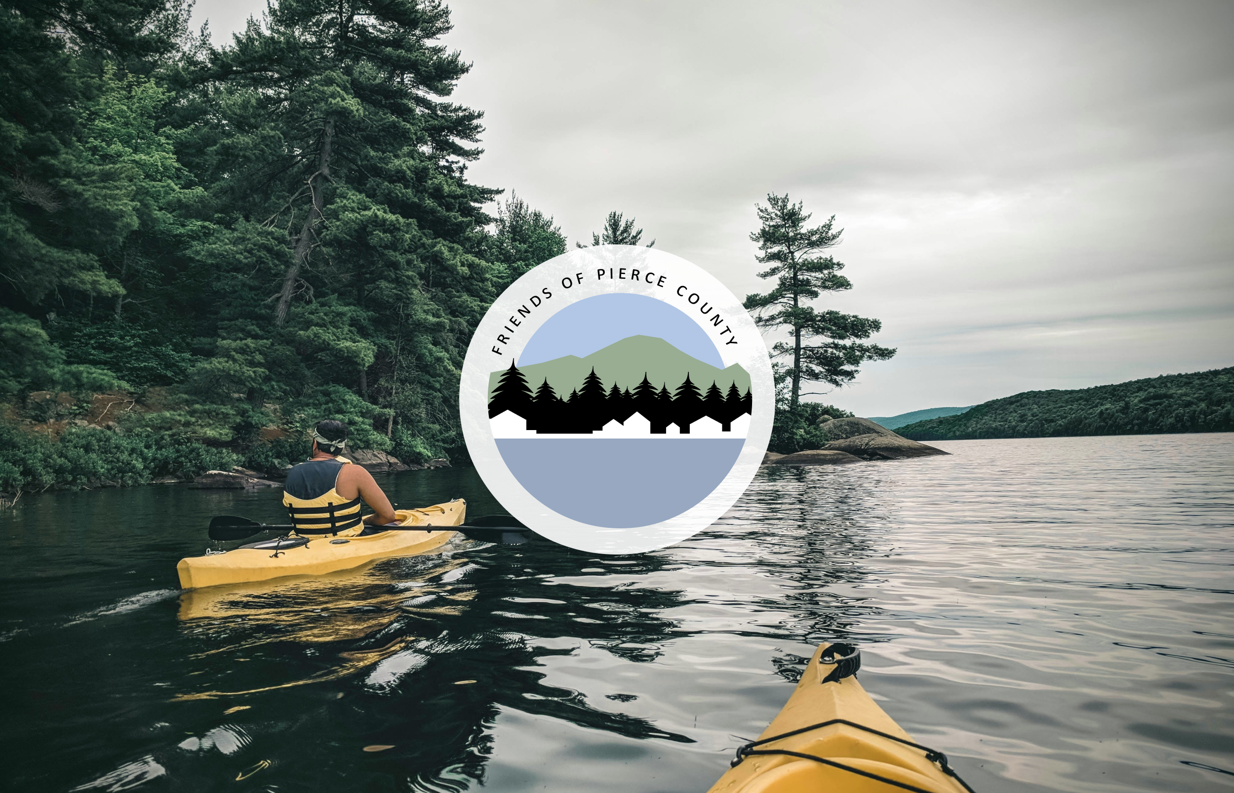
Logo Concept
Friends of Pierce County
About
The Friends of Pierce County is a , a nonprofit organisation that educates and empowers the people of Pierce County in Washington, USA with a focus on preserving and protecting their environment since 2003. They were looking to update their web presence and this included designing a new logo. The new logo should contain,
The words ‘Friends of Pierce County’
Aspects of nature and urban/rural development, in particular the congruence of people and nature

Discovering Pierce County
To redesign the logo and guide them to a style of the website, I wanted to understand what kind of work The Friends of Pierce County did, but also what their landscape and community was like. Being more than 8000 km away in France, my travels to Pierce County were solely digital. Yet, the more I discovered about this county, the more I wanted to see it in real life. Through images, new articles, blogs, advertisements, and the website of other local NGOs I discovered how diverse and beautiful Pierce County is but also the many issues it faces. This helped me to better understand the essence of The Friends of Pierce County.


Mood Boards
Once I had a better understanding of the organisation, the surroundings and the community that lives in Pierce County; I decided to create two different mood boards that were based on the information that I had gathered during my research.
This first mood board reflects the natural landscape and the community spirit of Pierce County. The colors represent the hues of the local mountains and rivers. Yellow is used as an accent in images and a highlight of web features. The vintage national park patches are an inspiration for the logo, with their emblematic illustrations in bold lines and colors. The font is friendly and inviting, yet professional. The images reflect the local landscape and the strength and positivity of community work and advocacy. The background has a recycled paper texture to give the site a natural feel.
Inspiration for the second mood board was the wetlands in Pierce County. Again the color tones reflect the landscape, yet this time focusing more on the fens and marshes. Imagery is bright and shows the natural beauty of Pierce County and man’s interaction with it. The font is light, clean, and professional. The logo would be a simple line logo much like the one beside the Friends of Pierce County text. Further icons and illustrations would be in a similar style, such as the three leaves. The watercolor stains add a playful texture to the page and reflect the abundance of waterways in Pierce County.
Logo Concepts
Although The Friends of Pierce County liked both mood boards, the members of the board leaned stronger towards the first design.
Having set the general style for the website with the mood board, my goal was to create a logo that has the same feel as the national park patches. For this, I created 3 logo concepts, each featuring details from Pierce County.
“Logo 1”
On the water…
The inspiration for this logo was the vast amount of waterways and lakes that Pierce County has. I wanted to show man’s connectivity and interaction with nature. I purposefully chose for two people in the canoe to represent ‘friends’ of Pierce County.


“Logo 2”
The Bridge
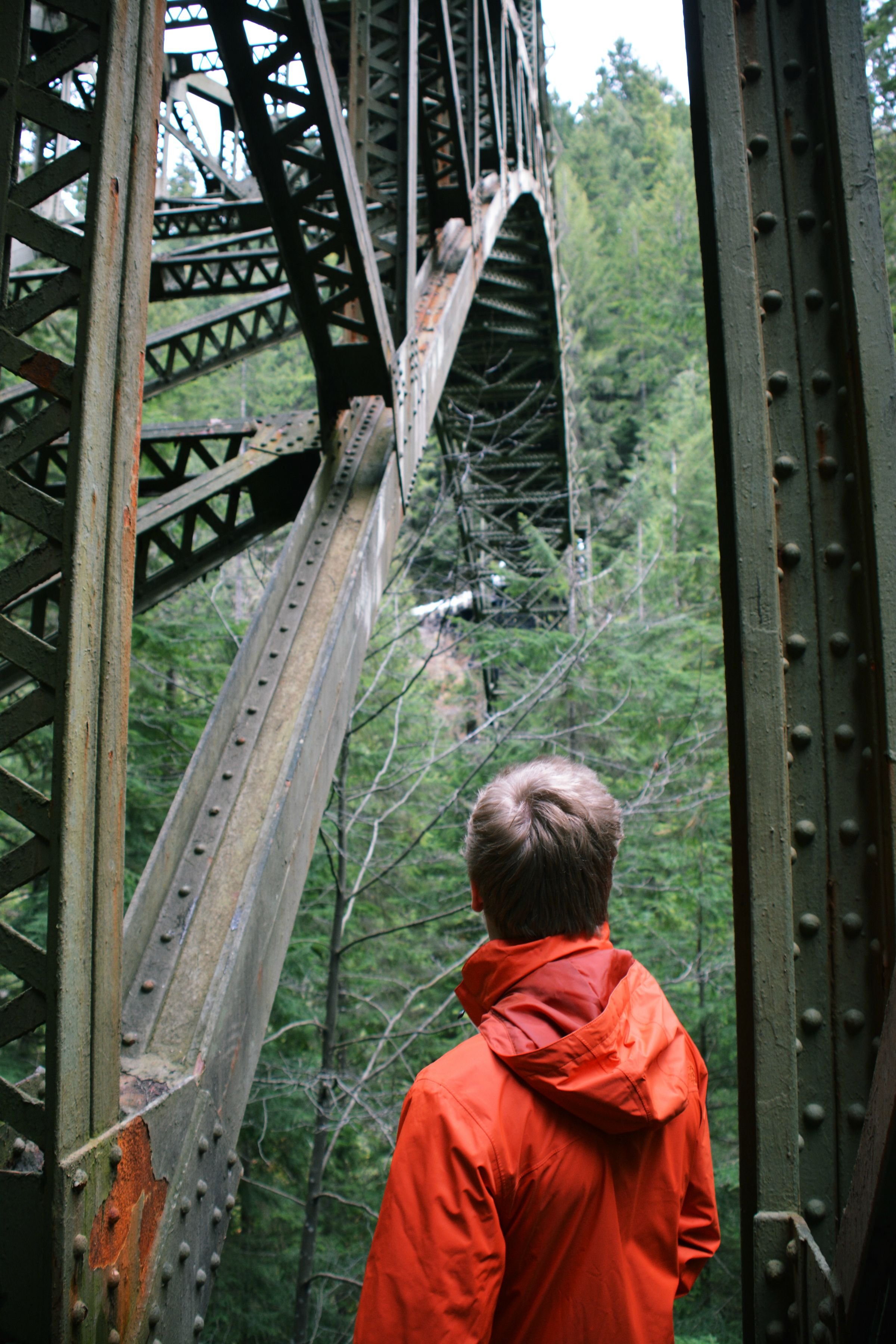
I discovered that Pierce County has a beautiful old industrial relic, the Fairfax Bridge built in 1921. Nestled in the woods it seemed to me a great way to show man’s development in nature but also the connection with the beautiful surroundings that people have when they now go there. It is a bridge between then and now, industrial and nature, work and recreation.


“Logo 3”
The Shoreline
This logo is inspired by the many people in Pierce County that live along the waterways, lakes and ocean with a direct connection to nature. For many the iconic shape of Mount Rainier can be seen in the distance.


The Final Logo
From the previous round the shoreline logo was selected as the most relevant for the Friends of Pierce County. After receiving feedback on the logo and trying to stay true to the original design yet incorporate some of the input given I made a few slight alterations. Most significantly is the the break in the shoreline with both development and open land on either side. Since man’s interaction with the environment is a key element to Friends of Pierce County, a canoe paddling off the shoreline was added. All colors included in the logo are a gradient of the original colors of the mood board.


Shout out to…
FOR THE BEAUTIFUL PHOTOS & ILLUSTRATIONS
Harryarts, Rawpixel , Mockupguy2, iBrandify, Creative_hat @Freepik