

ABOUT | THE SCENARIO | VISUAL INSPIRATION | USER STORIES | USERFLOW | WIREFRAMES | USER TESTING | HANDOFF | PROTOTYPE
About
Husk & Hull was designed for my final student project at Careerfoundry. The goal of this project was to create a responsive online shop where users could find products quickly and easily to match their particular needs.
My Role
User Testing, User Flow, Wireframing, Prototyping, UI-Design
Tools
Sketch, Photoshop, Miro, Balsamiq, Invision
Duration
19 Aug - 12 Oct 2021

The Scenario
The Problem
Many people would like to make a change for themselves, others and the world by consuming less and more sustainably. One of the ways to do this is to be more conscious about your purchases. Purchases that are biodegradable, long lasting and or recyclable make less of a negative impact on the environment. Though it sounds simple, it can be quite a hassle to find alternatives to items that aren’t very sustainable, especially when you are on a busy schedule.
The Solution
Husk & Hull provides a solution to this problem by delivering sustainable, natural and long lasting homeware directly to the front door. It’s all in one place, there is no need to go from shop to shop. All you have to do is browse through the site, pick the items of your choice and wait for them to be delivered at your front door. Since most of the items are made to last, Husk & Hull understands that customers want to be 100% satisfied with the items they buy. That’s why Husk & Hull offers free shipping returns within the first 30 days of receiving your package.
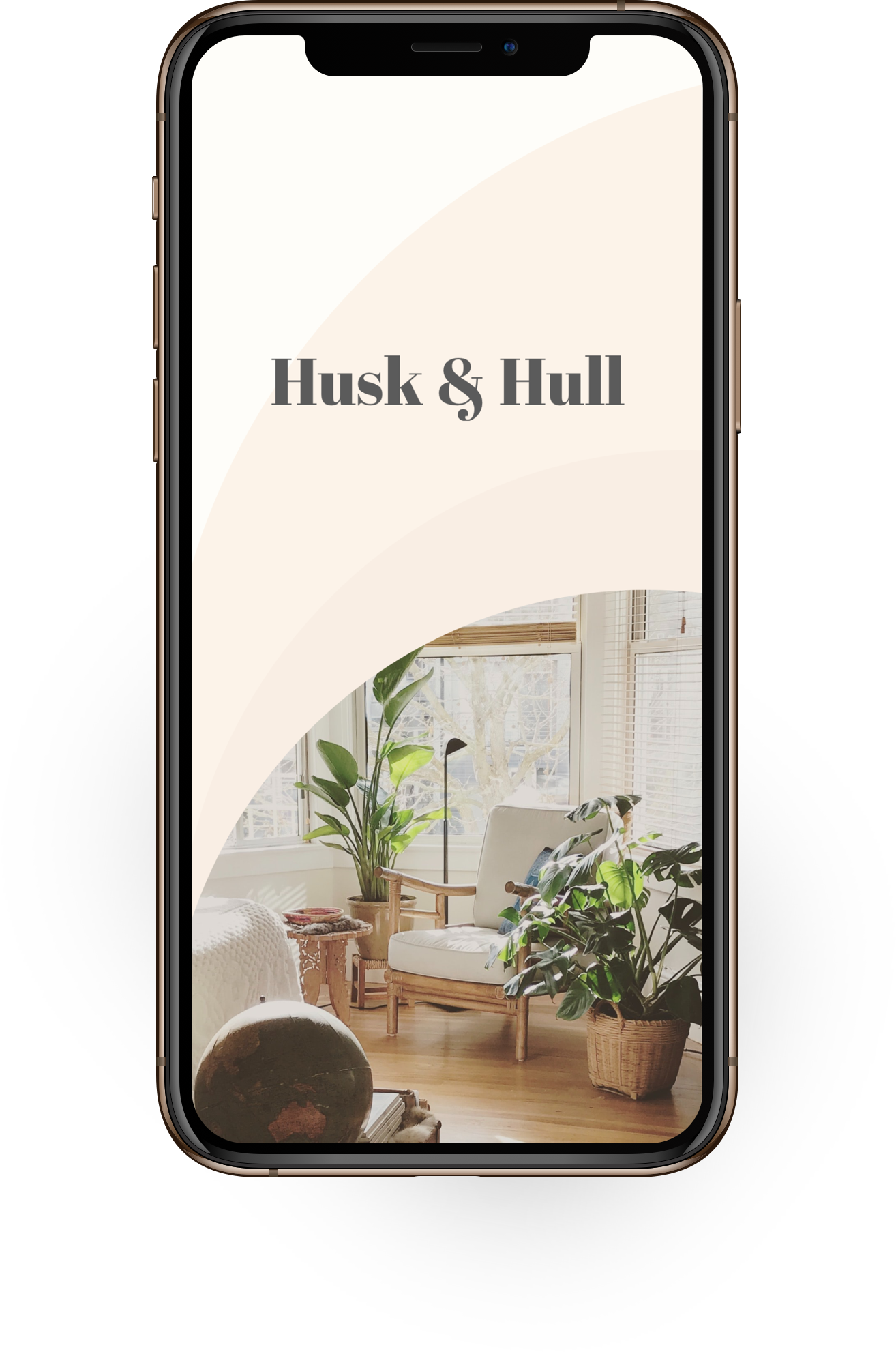
Visual Inspiration
The inspiration for the color scheme and the imagery in this app are the products themselves. Many of the natural materials used for the products have a warm soft color to them such as straw, bamboo or wool. The images and colors are there to complement each other giving a warm natural clean and cozy feeling. The title font is bold and elegant and stands firm against the soft tones of the app.


User Stories
Three user stories were created in order to see what paths the users of Husk & Hull would be taking and what steps they would need to take along the way. User story #2 was then used for the next step, the user flow.

“As a customer, I want to be able to buy all my sustainable houseware products in one place, so I don’t have to shop from store to store.”
1.
2.
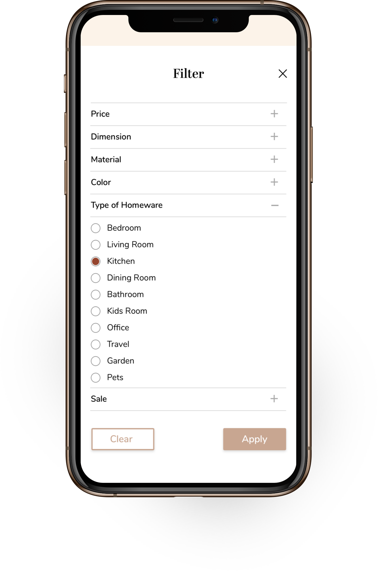
“As a customer, I want to be able to filter for the materials and items that I am looking for, so I don’t have to endlessly browse through the app.”
“As a customer, I want to be able to return products without any hassle, so I am not stuck with purchases that I regret.”
3.
User Flow
“As a customer, I want to be able to filter for the materials and items that I am looking for, so I don’t have to endlessly browse through the app.”
Success Criteria
Being able to buy the filtered items.
Entry Point
Loading Screen
Steps to Success
Can be followed by the pink steps in the userflow
Requirements from User Story
1. Filter for Items
2. Add to Cart
3. Sign up / Log in
4. Checkout
Low- & Mid-Fidelity Frames
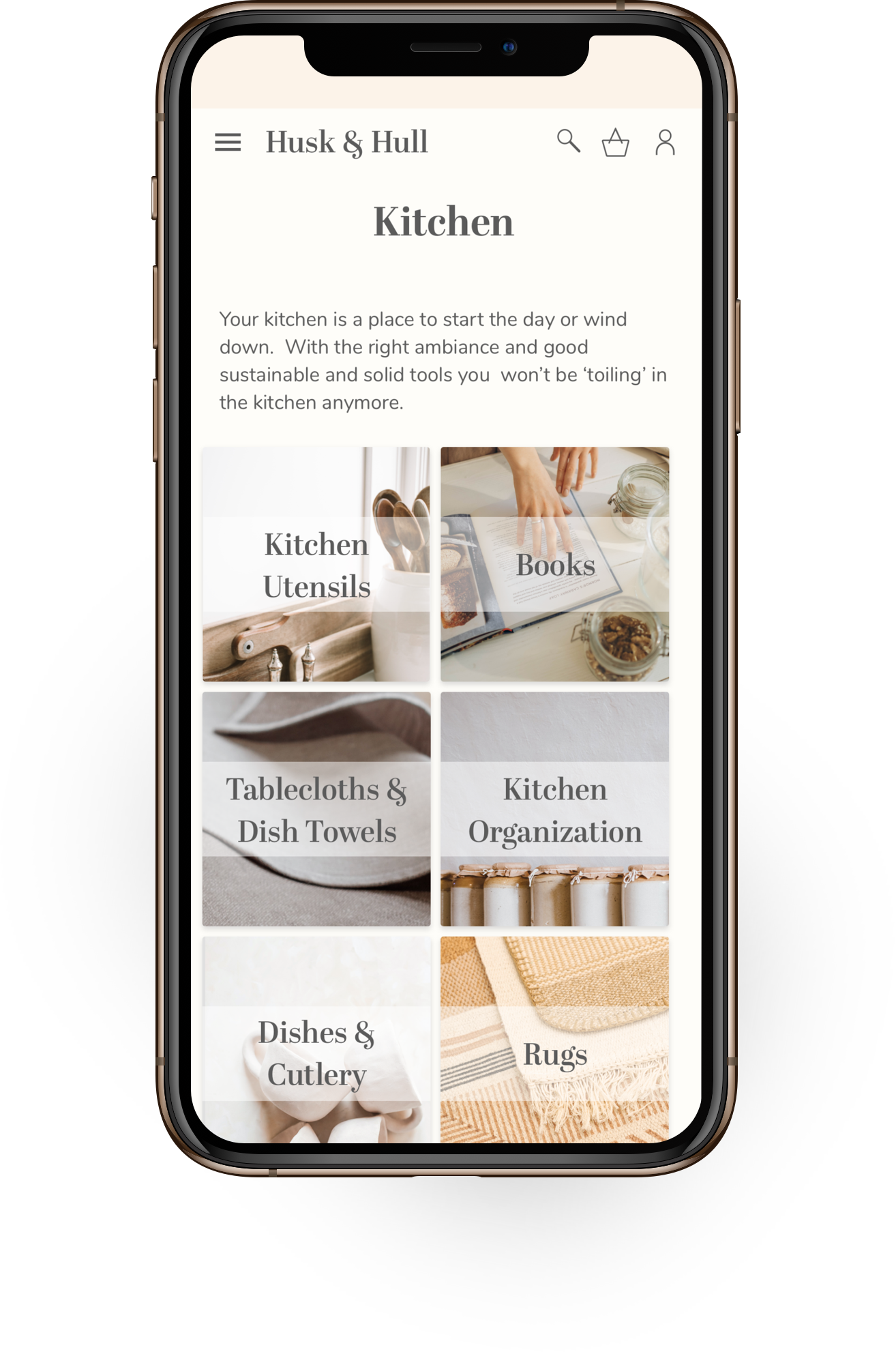
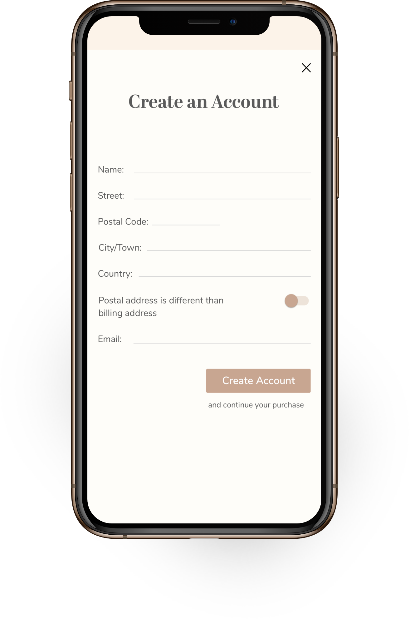
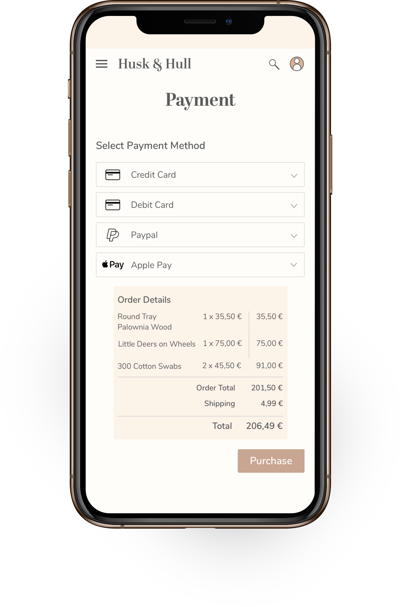
The user flow of user story #2 was then used to create the first initial wireframe sketches in Balsamiq. With the first blueprint made the screens were then converted to mid-fidelity wireframes. During the process I realized that I would like to give the users more (filtering) possibilities to find the item they are looking for. In the mid-fidelity frames the users can select products on the homescreen by material or living space, there is the possibility to get a complete overview of all products via the hamburger menu and on the screens with product listings there is an option to filter the search results. This benefits the user by making it easier for them to find the item they are looking for with only a few taps/clicks. During the checkout process it is possible to sign up/log in, preventing the user from having to fill out all thier information the next time they place an order.


User Testing

In order to find out if the screens derived from the userflow were easy to understand and functional the wireframes were put into a preliminary prototype. Four users were given the task to buy a rustic oak cutting board with thier credit card. I did not give the users any guidance into how they needed to reach this goal because I wanted them to use the app intuitively.
The Feedback
The users found the app easily navigable and straightforward. Feedback consisted solely of smaller design iterations.

Handoff
The mid-fidelity screens were then adapted according to the feedback of the user testing and the overall style, color and images were added to the wireframes. A responsive screen was created to showcase what the app is capable of. The final result is a sleek and elegant online shop that provides you with all the natural homeware that you may need.


Watch Husk & Hull in Action
Shout out to…
FOR GUIDANCE & SUPPORT IN THIS PROJECT
Beata Mendyk, Ben Howard, and my fellow peers @ Careerfoundry
FOR THE BEAUTIFUL PHOTOS & MOCKUPS
Maddi Bazzocco, Beazy, Tayla Brand, Timothy Buck, Hannah Busing, Suhyeon Choi, Ryan Christodoulou, Jacinta Christos, Andrew Donovan, Isak Engstrom, Maria Ilves, Irina Iriser, Uliana Kopanytsia, Marianne Krohn, Linh Le, Nathan Oakley, Mockup Graphics, Paul Robert, Maksim Shutov, Taisiia Stupak, Augustin Wong , Sarah Chai, Cottonbro, Karolina Grabowska, Polina Kovaleva, Ron Lach, Tatiana Syrikova, Rawpixels.com